The turkey’s ordered. The guest list keeps growing. And somewhere between the pie and the place cards, you looked at your living room walls and thought: “Hmm.”
If you’re hosting this holiday season, your living room and dining room are about to do a lot of heavy lifting.
The right warm paint color can make those spaces feel cozy, inviting and pulled together, never stark or cold. If you’re thinking about interior painting in Tampa before the holidays, here are the warm living room and dining room colors we keep coming back to, plus what the job looks like when you hire us.
Why Warm Colors Work for Hosting
Warm colors make a room feel welcoming. Our color psychology guide explains that warm, rich tones create energy, warmth and conversation, which is exactly what you want around a holiday table.
Warm neutrals do the same thing more quietly. They make a space feel soft and comfortable while letting your décor, your table and your people be the star.
Warm Living Room Paint Colors We Love
Shoji White (SW 7042)
Looking for a warm white that never feels stark? Shoji White balances warmth and brightness, with subtle greige undertones that work in almost any space. It’s ideal for open-concept homes, living rooms, bedrooms and trim, anywhere you want a timeless, elevated look.
Accessible Beige (SW 7036)
A dependable, timeless warm beige. It’s been a go-to for homeowners who want warmth without leaning too tan or gold, which makes it an easy choice for a living room that connects to the rest of the house.
Crushed Ice (SW 7647)
A soft, warm off-white with subtle gray undertones. It reads clean and light without feeling cold, so it’s a versatile base for almost any room.
Warm Neutral Paint Colors That Flow Room to Room
If your living room opens into your dining room (hello, Florida open floor plans), color flow matters. That’s why we love The Warm Neutrals Collection, five coordinating Sherwin-Williams shades we built for a Tampa Bay client:
- Crushed Ice SW 7647. A soft, warm off-white base.
- Pussywillow SW 7643. A deeper, grounded warm gray for contrast.
- Accessible Beige SW 7036. A timeless warm beige.
- Sandstone. A Valspar color, color-matched by Sherwin-Williams, that bridges the light and deep tones.
- On The Rocks SW 7671. A bright, versatile warm gray that goes with everything.
They all share the same warm undertone family, so you can use different shades in different rooms and the whole home still feels connected.
Dining Room Paint Colors with Warmth and Drama
Turkish Coffee (SW 6076)
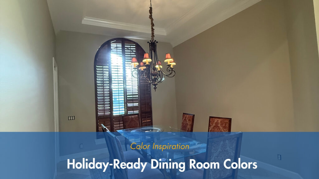
Want a dining room that feels like a candlelit dinner every night? Turkish Coffee is a deep, warm brown with rich red undertones. It brings boldness and sophistication, and its grounded presence makes it ideal for dining rooms, home offices or a moody accent wall.
Go bold with red tones. According to our color psychology guide, red is one of the most stimulating colors on the spectrum. It creates energy, warmth and conversation, which is why it works so well in dining rooms and entertainment spaces.
What Interior Painting in Tampa Looks Like When You Hire Us
Picking the color is the fun part. Here’s what happens after you hire Polson Painting for your living or dining room:
- Color help. On full interior and exterior painting projects, we provide color samples and help you pull your colors together so your rooms flow.
- Furniture and floors protected. We move furniture to the center of the room, cover it and lay drop cloths over the floors.
- Proper prep. We patch nail holes, spot prime stains, caulk gaps and sand trim where needed.
- The right finish. We recommend flat, satin, semi-gloss or gloss for each surface.
- A final walk-through. We clean up, then inspect the work with you to make sure you’re happy.
Tips Before You Pick Your Color
- Check the undertone. Every color is warm or cool underneath. A white that looks clean on the chip can read yellow or blue-gray on your walls.
- Test it in your own lighting. Natural light, artificial light and window direction all change how a color reads. Look at a sample in the morning and at night.
- Don’t trust a tiny chip. A small swatch looks completely different from an entire wall.
- Ask about sheen early. The finish changes how a color reads, so talk it through during your estimate.
Frequently Asked Questions
What are the best warm living room paint colors?
Warm whites like Shoji White (SW 7042) and warm neutrals like Accessible Beige (SW 7036) are reliable choices. For a full palette, check out The Warm Neutrals Collection.
What color should I paint my dining room?
For warmth and drama, try a deep, warm tone like Turkish Coffee (SW 6076). For a softer look that flows into your living room, a warm neutral works beautifully.
Can Polson Painting help me choose colors?
Yes! After you hire us for a large painting project, your first three color samples are complimentary. We help you pull the colors together so your home flows from room to room.
Do you offer interior painting in Tampa, FL?
We do. We provide interior painting across Hillsborough, Pinellas and Pasco counties. We move and cover furniture, protect your floors and clean up when we’re done.
Ready for Interior Painting in Tampa?
Let your walls set the mood this holiday season. When you’re ready to hire a pro for interior painting in Tampa, Polson Painting has helped Tampa Bay homeowners find the right colors for 30+ years, and we use Sherwin-Williams paint on every job. Let’s make your home PAINTASTIC.
Get your free interior painting estimate today. 📞 (813) 244-5270
Free estimates: Hillsborough, Pinellas, and Pasco counties.