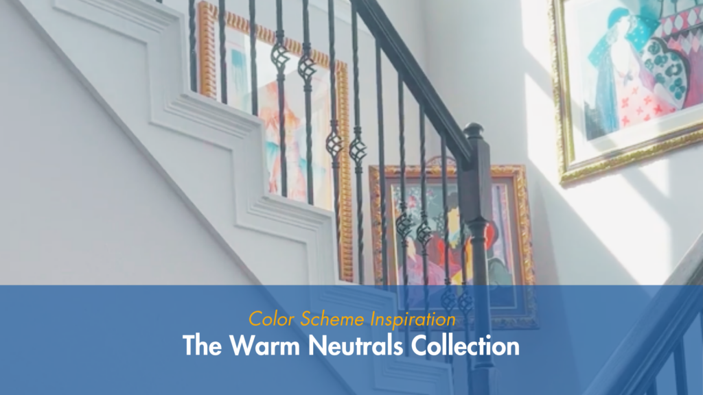
If you’re someone who’s collected art you love over the years, you already know the challenge: how do you paint your walls without competing with everything on them?
That was exactly the question one of our recent Tampa Bay clients brought us. Her home is full of colorful, meaningful art pieces — and she didn’t want a paint color that fought for attention. She wanted a backdrop. A canvas. Something warm and quiet enough to let every piece of art do the talking.
So we built The Warm Neutrals Collection — five coordinating Sherwin-Williams shades that work together to create exactly that.
WATCH ALL 5 PARTS ON OUR YOUTUBE CHANNEL:
The Palette
Crushed Ice SW 7647 — A soft, warm off-white with subtle gray undertones. It reads clean and light without feeling stark or cold, making it a versatile base for almost any room in the house.
Pussywillow SW 7643 — A deeper, more grounded warm gray. It adds contrast and depth in the spaces that need it, without ever turning cool or harsh.
Accessible Beige SW 7036 — A dependable, timeless warm beige. This shade has long been a go-to for homeowners who want warmth without leaning too tan or gold.
Sandstone — A Valspar color, color-matched by Sherwin-Williams for this project. It bridges the gap between the lighter and deeper tones in the palette, adding warmth and texture.
On The Rocks SW 7671 — A bright, versatile warm gray that’s become one of the most popular “goes with everything” neutrals for homeowners right now.
Why This Palette Works
Each of these five colors shares the same warm undertone family, which is what makes them work so well together — and why they work so well behind colorful art. None of them pull cool or gray in a way that would clash with warm-toned pieces, and none of them are bright or bold enough to compete with what’s hanging on the wall. Instead, they sit quietly in the background, creating a sense of flow from room to room while still leaving plenty of room for personality through art, furniture, and decor.
This is a great approach for homeowners who love color — just not necessarily on their walls. A warm neutral palette like this one lets your collection, your furniture, or your personal style be the star of the room.
Thinking About a Neutral Refresh?
Whether you have a house full of art like this client, or you’re just ready for a warm, cohesive palette throughout your home, we’d love to help you find the right combination for your space.
Transforming your home starts with the right color—and the right team.
📞 Call us at (813) 244-5270 or fill out our contact form to schedule your free consultation.
📍 Proudly serving Hillsborough, Pinellas, and Pasco counties.