Choosing the right cabinet color can completely transform your kitchen. But it’s not as simple as picking what looks pretty on the chip — and that’s where most homeowners go wrong.
At Polson Painting, we’ve helped hundreds of Tampa Bay homeowners navigate this exact decision. Here’s what you need to know before committing to a color.
Light vs. Dark: What Each One Does for Your Space
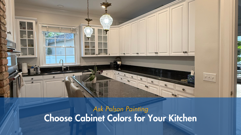
Light cabinet colors — soft whites, creams, warm beiges — make a kitchen feel larger, brighter, and more open. They reflect light and create a clean, airy feel that works especially well in smaller kitchens or spaces with limited natural light.
Darker cabinet colors — deep navies, forest greens, charcoal, rich espresso — add drama, contrast, and visual weight. They anchor the kitchen and make a bold design statement. They work best in larger kitchens with strong natural light and contrasting countertops.
Neither is better than the other. The right choice depends entirely on your space.
The Real Key: Balance
The most important factor in choosing a cabinet color isn’t the color itself — it’s how it works with everything else in the room. Your cabinets need to work with your countertops, your flooring, and your lighting. Natural light, artificial light, and the direction your windows face all change how a color reads on your cabinets. Always test in your actual lighting conditions — not just in the store.
Common Cabinet Color Mistakes
Choosing based on swatches alone. A small chip looks completely different than an entire kitchen full of that color. Always paint a test swatch on an actual cabinet door and live with it for a day or two before committing.
Ignoring the undertone. Every paint color has an undertone — warm or cool. A white that looks clean on the chip can read yellow or blue-gray once it’s on your cabinets.
Matching instead of complementing. Your cabinets don’t have to match your countertops exactly — they should complement them. Slight contrast creates visual interest and depth.
Popular Cabinet Colors in Tampa Bay Right Now
Sherwin-Williams Alabaster (SW 7008) — warm, creamy white that works beautifully in kitchens with natural wood accents.
Sherwin-Williams Naval (SW 6244) — deep navy blue, one of the most requested cabinet colors in the Tampa Bay market.
Sherwin-Williams Evergreen Fog (SW 9130) — muted sage green that brings warmth and a natural, organic feel.
Sherwin-Williams Tricorn Black (SW 6258) — bold, graphic, and sophisticated for homeowners who want maximum contrast.
Frequently Asked Questions
Q: What cabinet color makes a small kitchen look bigger?
Light, warm whites and soft creams reflect the most light and make small kitchens feel more open. Avoid very cool whites or very dark tones in small spaces without strong natural light.
Q: Should my upper and lower cabinets be the same color?
Not necessarily. Two-tone kitchens with lighter uppers and darker lowers are extremely popular right now. It’s a great way to add depth without going all-in on a bold color.
Q: How do I know if a cabinet color will work with my countertops?
Bring a painted sample board and hold it directly against your countertop, backsplash, and flooring. Look at it in morning light and under artificial lighting at night. If it looks right in both conditions, you have a winner.
Q: Can Polson Painting help me choose a cabinet color?
Yes — we offer color consultation guidance as part of our estimate process. Call us at (813) 244-5270 or visit polsonpainting.com.
Ready to Transform Your Kitchen?
Done right, painted cabinets become the focal point of your entire home. Done wrong, it’s an expensive fix. Polson Painting has been helping Tampa Bay homeowners get cabinet colors right for over 20 years.
Get your free cabinet painting estimate today.
📞 (813) 244-5270 | polsonpainting.com — Free estimates: Hillsborough, Pinellas, and Pasco counties.